Blind: Water Balloon Dynamics

This was the second most fun lab we did, using water balloons to experiment with shutter speeds and manual settings on our cameras. Aside from wanting to throw them at each other, we popped the balloons one by one to try to get the perfect shot, right as the balloon popped and before the water dispersed.

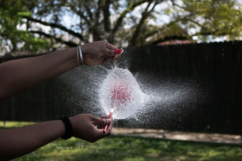
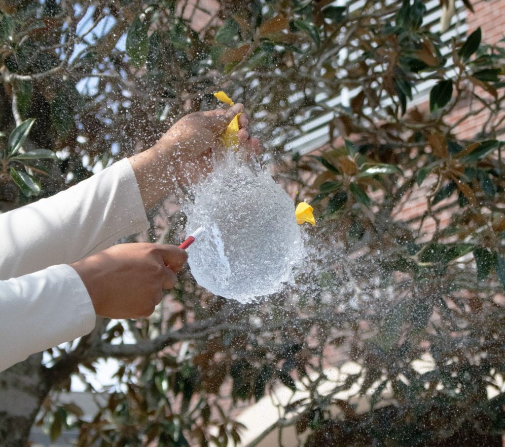
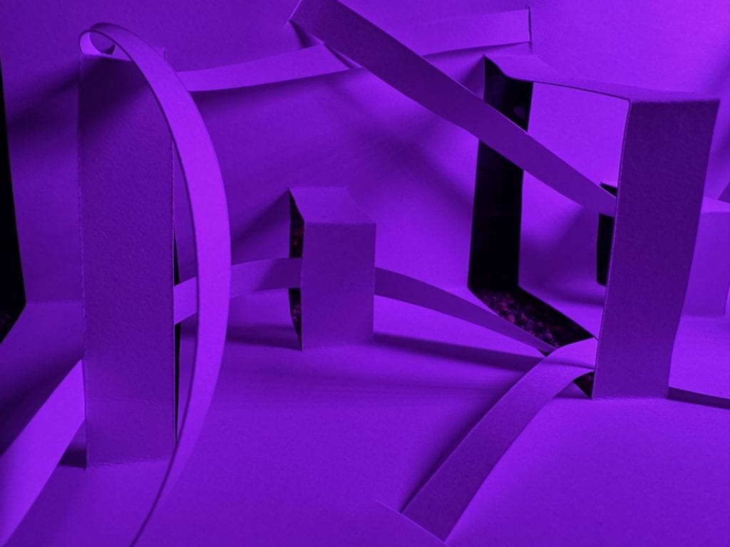
It was all about timing and clicking the shutter perfectly with the popping of the balloon. For my camera, my highest shutter speed setting was perfect, set at 1/4000. These shots were much more difficult to get than the shots of the paper structures because for the paper structures, we had plenty of time to move around and try different things out. For the balloon pops, it was one shot, and if you missed the shot, you’re out of luck. It was either missing shots because of bad timing or adjusting the focus wrong to ruin an incredible shot, like what happened to me when Jayden and Spencer did a double pop with the balloons in their hands.

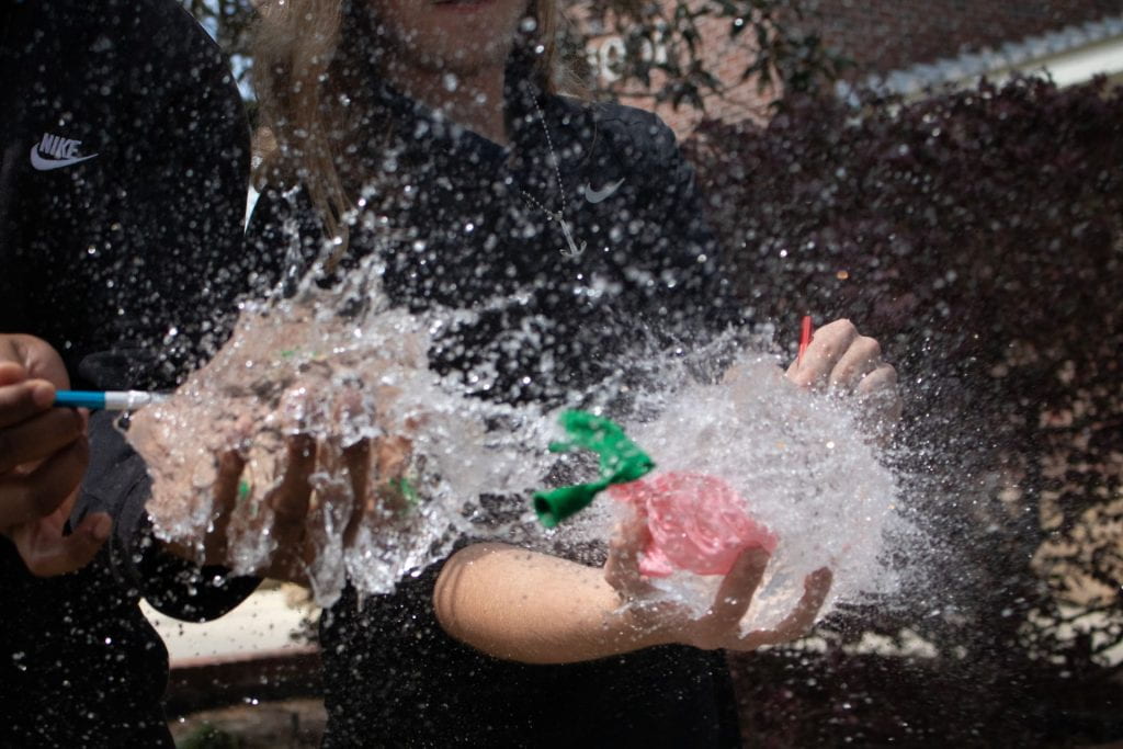
The photo otherwise would have been perfect. Even though it’s out of focus, I still love it as it showcases the motion of the simultaneous pops. This was only one of the challenges of capturing fast motion. The settings on the camera had to be just right, with a good balance between the aperture, shutter speed, and ISO. We also used different locations as we took these shots, so we were adjusting our settings with every take. We also had to anticipate the pop, as there was only a three second countdown beforehand. Even though the lab was somewhat complicated with the many settings adjustments that had to be made, this was definitely one of the best labs we have done all year.

Closing:

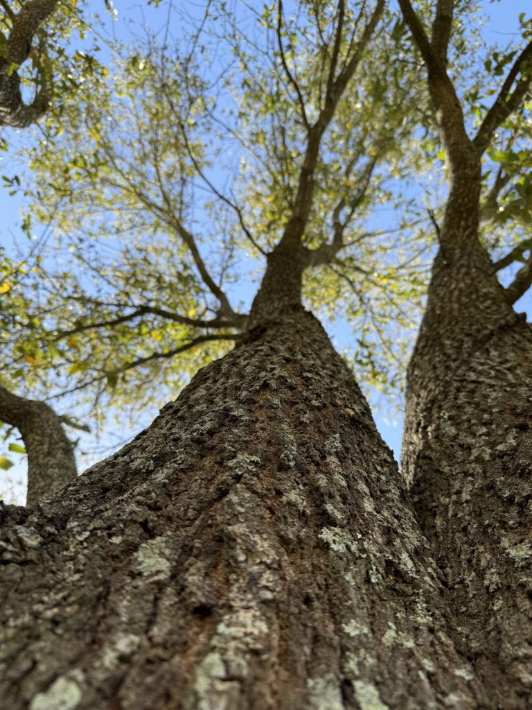
From this unit, I got very familiar with my camera and I learned how to turn mediocre shots into beautiful compositions. My creativity with my shots has also expanded a lot. I plan to try some more long exposure shots and also play with the manual mode more on my camera. I’ve never dived very deep into the manual mode until now, and it has improved my compositions so much. Being able to adjust what you want for your shots takes them to the next level, and to me it’s more satisfying whenever I take a photo I really like. The most significant lesson that I’ve learned from this unit is that there is always a different way to approach something, and I’ve also learned to think outside the box whenever I shoot because the result is usually a lot more impressive than I would expect it to be.

Blind: Blindfolded Test

This was the most fun, yet challenging lab. This time, we actually became blind photographers and had to take photos with our eyes shut. We took photos in front of the school first, and we had to use auditory calls from Mrs. Lee along with our prior knowledge of our surrounding areas to take pictures. We also experimented with some long exposure shots as well.

I first messed with some long exposure and took a few pictures of the flagpoles in front of the school. The wind was working in my favor and I caught some pretty decent flag-waving pictures. For the photo picture I ended up walking into a tree, so I used it to my advantage and put my phone up against the tree and took a surprisingly good photo of it. Being blindfolded for this lab changed my approach when taking pictures by focusing also on my hearing to take in my surroundings before I shoot.

The real fun part of this lab is when were told to go home and take pictures at our houses. this was good for me because I know my house layout like the back of my hand, and it showed. I managed to feel around my living room until I found my cat and my dog and took pictures of them. Then I used support columns to lead me to the stairs and I carefully made my way upstairs to my room. A stubbed toe later I was able to find my saxophone case, put it on my bed, open it and take a picture of my horn.

I used mainly the memory of my house’s layout the help me navigate around, but my hearing was also another very important sense as I could hear my cat purring on the couch. My sense of touch was also important to find the latches on my saxophone case and opening it. I also felt around on the walls to further prove to myself where I was in my house. Being at my house, I was able to push my photographic style by using my senses to find out what I was doing and I was also able to take my time. I was in no rush to find my way around, and I was able to take everything in, just without my sight.

Blind: Shadows and Light

Emulating a completely blind photographer was much more difficult than I thought it would be. It is imperative to know your exact surroundings and how to use them to your advantage in your shot. For our shadows and light lab, we used 3D structures made out of paper we cut and designed.

For my paper structure, I decided to form some linear doorways of different sizes. I then contrasted it with strips of paper that flowed in and out of the doorways to add some curves to the structure. For the photo on the left, I decided to put light directly down on the structure and angle the camera so that not very many shadows can be seen. However, for the photo on the right I turned the structure on its back and put the light at a diagonal angle to crate lots of shadows in an almost illusion-like style.

The choice of paper structure shapes influenced my shadow designs heavily because of the major contrast of the straight-edged doorways and the winding curves of the other strips. Changing light angles completely affected the shadows as one angle could capture heavy shadows from the doorways. Another angle, usually opposite of the primary angle would usually capture the heavy shadows from the strips of paper. My understanding of shadow changed whenever I focused on capturing it in different lighting conditions because I had to find different unique angles to shoot from. It was more difficult than I thought to find different shadow positions and angles, so I had to do a lot of experimenting before I had some shots I was happy with.

Blind: Light Paintings

This is our Blind Photography unit. For this project, we focused on light painting, which is a technique to shoot with long exposure to create a “painting” with lights. Our spotlight artist was Pete Eckert. He was diagnosed with a condition with his eye and over time, he went from being sighted to being completely blind. He didn’t let this step in the way of his photography, as he began to use long exposure and lights to create beautiful light paintings.

I began to take my hand into this by trying some long exposure shots with some objects that I liked. Eckert’s car photo was a major inspiration since I love taking photos of my truck, so I decided to freestyle with it. I set up a tripod on a street by my house, put the camera behind my truck and set the shutter speed to 30 seconds. Once I hit the shutter button, I got in my truck and slowly drove off, carefully swerving across the entire street.

I tried some things with my saxophone as well. I put my saxophone on a stand in a completely dark room. I then used red and orange lights to put a fire-like glow around the entire horn. This was also inspired by Eckert as he did a similar photo with “flames” around a car. I also put a blue light on one side of the room to create some contrast.

I was pleasantly surprised and very impressed with the result of this photo. When capturing light and motion, the shutter speed and exposure are huge contributing factors in it. The ISO needs to be set just right to make the lights pop out. The shutter speed needs to be very slow in order to make the painting. Whenever these two factors come together in an image, the result is usually spectacular. My favorite part about making these images was that it was just fun to experiment with different settings to find the one the worked best for the shot. Patience was also a key factor. For example, it took many tries to get the right shot of my truck, as I either drove too fast and the lights didn’t capture how I wanted them to, or I just didn’t like the shot overall. The patience was worth it though, as the photos I took with this project are some of my all-time favorites.

Shadows and Light

For this lab, we went outside and experimented with the manual modes on our DSLR to capture the positives and negatives of light.

For both of these photos, I used my Canon 18-55mm lens in Manual mode, 1/200 shutter speed, f-stop at 9.0, and ISO at 100.

The photo on the left shows the contrast of the fence posts and the shadows of the tree branches. The photo on the right is split down the middle of an area abundant with sunlight and shadows of brush, while the other side is completely engulfed with shadows. When I was shooting these photos I was struggling to find composition settings that would emphasize the shadows, however I found a low ISO and a fast shutter speed would do the trick. For the photo on the left I would have liked to find a better contrast to the tree branch shadows. In post I turned down the saturation of the red fence and it made the shadows pop out some more. This contradicts my post edits for the photo on the right as I turned up the saturation and it made the shadows come out. This lab made me realize how important light is in the composition of photos. It also allowed me to work with shadows and use them to make photos more interesting. The photo on the right is my favorite because it shows a clear definition between positive and negative light. Going forward, I want to take what I learned in this lab and use it in my future photo shoots.

The Close Up

I believe self expression is a characteristic that everybody has, and differs from person to person. It’s extremely important that we self-express because if we didn’t, the world would be boring; emotionless and lifeless. There would be no fun, no personality to anybody. The value of expression lies in the compositions of my original work and everything I do to get the shot that I want.

My Renaissance painting showed a young man in a brown shirt and a red covering on his head. He had long ginger hair, similar to mine. He had a blank expression on his face. My inspiration for recreating a photo like this was a photographer by the name of Hendrik Kerstens. He used his daughter as the person in the photos, and used household items such as towels or bubble wrap as different articles of clothing to recapture the Renaissance essence. Her facial expression was similar to the ones in the original Renaissance paintings. Our project was inspired by his work, especially the use of household items in the portrait.

My portrait was pretty easy to make. I used a brown shirt, combined with a red hand towel for the head covering, all in front of a black trench coat for the black background.

This is one of my more artistic selfies. It might not look like much, which is how I like to express myself. I like to keep to myself and that’s what my selfies portray. It’s one of my favorite pictures from the selfie project as it captures me; laid back and pretty chill.

Entering a New Season: 2025

2024 was, to say the least, not my best year. So many different things happened, both good and bad, that I couldn’t even begin to talk about them here because I’d be rambling all day. It’s safe to say 2024 did not treat me very well; however, I look into 2025 with hope and some motivation to improve myself. As a student, I plan to study more and strive for all A’s at the end of the year because I do not want to be stuck having to take finals. As a photographer, I plan to continue my journey into college and maybe minor in something to do with photography along with a possible music major. For a short-term goal, I want to go out and just take more pictures in my free time. I haven’t really been doing much photography outside of school, and I want to start doing more outside of my seventh-hour class. For a long-term goal that I can accomplish by May of 2025, I want to be able to be better at using my DSLR. I still have a lot to learn about it that I can definitely accomplish in this class. After this semester, I am going to continue being a nerd and doing vehicle photography, as it’s the most fun for me to go out and do. We’ll see what 2025 has to offer; I have a feeling it’s going to be pretty good.

The Closeout of 2024

2024 was an interesting year to say the least. My photography journey has taken an interesting turn as well since I began to take Photography I. These are some of my favorite photos that I’ve taken during the first semester of Photo I.

These 3 photos were part of the Elements of Photography and Rules of Composition project. Starting on the left, I took a photo at the Baton Rouge airport of the LSU football team returning from Las Vegas. It was fun to track the plane coming into Baton Rouge and watch it pull up close to the general aviation area. The photo in the middle is a photo of the engraving on my saxophone. I love how it looks across the bell area, and putting it in the natural light enhances its look. The photo on the right is a picture of my truck after I hand washed it. I take lots of pride in the cleanliness of my truck, and I love taking pictures of it. The photo of the planes was my experimentation, the saxophone picture was contrast in lighting, and the photo of my truck was space.

 This photo was a part of my midterm selfie project. We were required to take selfies of ourselves in different areas or doing different things. I wasn’t expecting for this photo to be a part of the project, but I loved it so much that it ended up in my finals folder. I took this photo in the dressing room of the Manship Theatre just minutes before I went on stage and performed one of my largest concerts with jazz trumpet player George Bell. I love the way I set this photo up with me looking at my reflection along with the atmosphere around me.

These next 4 photos came from our very first trial run in August. I love these photos as I took them to capture the beauty of our school’s campus. I took a photo of the empty hallway from a low profile to make it look a little larger so I could add some emphasis. I also took two photos outside to capture some of the natural scenery of the school. The last photo includes the many awards that Zachary has received for being the number one school district.

 These last two photos were done in Adobe Photoshop as part of the Change My Mood project. The first photo shows the side profile of a man. It originally had many neon colors across the photo, which I changed all to a flat blue to change the mood to a more sentimental feel. For the second photo I wanted a more aggressive feel to the photo, so I changed the background color to a deep red and greyed out the man. I feel the edits I made were successful in getting their respective messages across. 

Learning File Formats

There are many different file types used in photography. Here are some of the more common ones used in photography and their functions. 

First is the JPEG file, or “Joint Photographic Experts Group.” Many people know of this filetype, which is one of the most common files on this list. JPEG images don’t have the highest quality, as the image is compressed right at the capture. However, the upside to this is that they don’t take up a lot of storage at all, so many JPEGs can be stored in one place or on one memory card. Another upside is that JPEGs have almost no compatibility issues. You can view them on almost everything, and they are compatible with almost every editing software. These kinds of files are best used for personal use.

Next up is the HEIF, “High Efficiency Image Format” filetype. It’s also the newest filetype on the list, as it was designed in 2015 and is used by Apple for iPhone photos. These files take up even less storage than JPEGs; however, they have some compatibility issues. Many editing programs cannot handle HEIF files, and they are hard to display on internet browsers, which is a huge downside. These files are best used for rapid transfer and personal use.

The third filetype is TIFF, or “Tagged Image File Format,” which is one of the most common filetypes sued by photographers. These photos are extremely high quality as they are not compressed, which also allows for a lot of editing. A small downside is that these files take up a lot more storage than JPEGs or HEIFs. TIFFs can only be displayed on some browsers. These files are best used for high-quality photos and editing.

Next is the RAW file. These files are of the highest quality for images and are used by many professional photographers. These files store all of the original information captured by the camera, which allows for extensive editing. However, these files cannot be displayed in a browser and require editing software such as Lightroom to view them. They will have to be edited and converted to a different filetype. These files are best used for high-quality images and a lot of post processing. 

Next up is the DNG, or digital negative file. This filetype was created by Adobe to attempt to create an alternative to RAW files that can be used by all cameras and manufacturers. DNG files will be guarded against future incompatibilities for RAW files, which is a major benefit. These filetypes are used for long-term edited files that can be converted from RAW files to guard against incompatibility.

Now another commonly known file, the PNG. This filetype was designed in the 1990’s. They don’t require much storage, can be relatively high quality, and can be displayed on internet browsers. These filetypes are best used for the storage of many high-quality images and on internet browsers.

GIF files are next, and they are perfect for internet use. GIF files allow animation and are small file sizes, which makes them great on browsers. It supports transparency, but not partial transparency. GIFs are not best used for photos but rather images with a limited color palette, as GIFs only contain a maximum of 256 colors.

BMP files were developed by Microsoft for use on the Windows platform. Now it’s supported by Macs too. They have a large file size as color data is saved for each pixel, which makes images very high quality. These files are best used for high-quality images that are not shared on the internet, as many browsers don’t support them.

Lastly is the PSD, which is used by Adobe Photoshop to save data. One of the biggest benefits of a PSD is that it saves multiple layers of data and is great to be used for editing in Photoshop. Layers can be added, removed, or edited without affecting the original photo. Once it is saved, it can be converted to any filetype. PSDs are best used for photo editing, specifically in Photoshop.

Remembering the Impact

It’s been a little over 23 years since the terrorist attacks on September 11th, 2001. On that day, two hijacked airliners, American Airlines Flight 11 and United Airlines Flight 175, struck the World Trade Center, more commonly known as the Twin Towers. This attack destroyed the lives of countless innocent citizens and ended the lives of almost 3,000. Two more airliners were hijacked that day, American Airlines Flight 77 striking the Pentagon building and United Airlines Flight 93 (supposedly aiming for the White House) crash landing before it arrived. This attack changed the entire nation and how we lived. My parents remember exactly where they were and what they were doing when they found out about the attacks. For me, being born in 2008, I didn’t experience 9/11 firsthand. However, me being an aviation geek has led me to look into this event more, especially the photography of the events that day. For example, this photo of United Airlines Flight 175 just seconds before impacting the South Tower at 9:03 a.m.

When I look at this image, I imagine the utter shock and terror of everybody watching from the ground in New York City. I also imagine the people in the Twin Towers watching Flight 175 rapidly approaching. I can easily visualize the sight and almost hear the screams of people in the South Tower as Flight 175 hit. Even though I didn’t live through this event, the photographs from that day help depict how terrifying 9/11 truly was. The photo below of Flight 175’s impact is one example.

Seeing that massive explosion next to the North Tower, already smoldering from American Airlines Flight 11, puts many different emotions in me. I have heard recordings of the phone calls of people in the towers calling for help. You could hear the towers when they collapsed on the people, making these photos a lot more chilling to me. These photographs are tragic but important for documenting this moment in American history. Documentary photography is used to capture moments that have a major impact, such as a major moment in history like 9/11. Documentary photography plays an important role in 9/11 as closer pictures were captured, showing the decisions some people in the towers were making, such as jumping nearly 100 stories to their deaths. 

Seeing pictures like this strongly emphasizes how important documentary photography is. The cameras broadcasting videos of this event across the world weren’t able to get shots like this. Seeing those people hanging 100 stories high from windows, literally helpless, shows how truly tragic 9/11 was and how documentary photography gives an insight into that. The imagery impacts the experience for me because it brings a complete understanding as to how immense and tragic of an event this was.